Thursday, 27 February 2014

Illustrator - Initial Ideas


Initial Ideas:

Starting this aspect of my assignment is very closely linked to starting the whole assignment, my only benefit is that now I have a basic concept. I have created my DVD inlay based around a Sex and the City theme. I also now have a colour scheme and a general feel for my product as a whole which can be seen from my Photoshop blog posts. The issues with this is the tools which I need to use in order to achieve my DVD label. I should be aiming to use vector shapes and text as well as free hand drawn elements. I will be sticking to my original colour scheme as this will give a professional feel and consistency.

My initial thoughts for a background involve the idea of a pink gradient with clouds made from a variety of different oval shapes. This will be an element which was made from scratch. I could also look into making some of these clouds using the pen tool and have some as an outline and some as a solid fill using the oval tool. This will hit different aspects of my criteria. An idea which I could use is placing images. I am not sure yet which images I would like to take from my DVD inlay however the three girls would be a good place to start. The title of the film will hit the type tool criteria. I like the idea of placing this to one side of the central hub. This would ideally sit in front of the image. I could look into text wraps to create different effects of this. I will also create a logo using vector shapes and then simply add an age rating and other important logos.

The main focal points of my DVD disk should include at a minimum:

1.      The colour scheme I previously created

2.      Ideally all three main characters however the main character would be acceptable

3.      The DVD logo (This should also be applied to the DVD inlay)

4.      Any relevant DVD logos such as Age Ratings


A second initial idea which I have come up with includes a sample of the main image on the front of my DVD inlay. I could give this a pink transparency over the top and then use the text tool to add my title. This would be positioned on the bottom half of the disk. I could use a clipping mask to make this image fit the circular DVD however the brush and pen tool would need to be incorporated however I’m not sure how this could work as yet.

Illustrator - Introduction to Disk Design


Introduction to Disk Design:

Designing and creating a DVD disk label is the second aspect of this assignment. Like the Photoshop assignment I have a set criteria which I have to meet and then anything that I do which is extra will be only improve my grade but also my final product. As a minimum I need to use the following tools: use in Illustrator of the pen tool, type tool, placing images, brushes, clipping masks, guides, layers, transparencies, text wrap. I will and have been gaining the basic skills within all of these mandatory requirements and then taking these skills and playing/experimenting to widen my knowledge. My next blog post will show my initial ideas for my DVD label.

Thursday, 20 February 2014

Photoshop - Thoughts And Ideas For Back Cover Images

Now I have the basis and design sorted for the front of my inlay I feel its time to start looking at the back cover. I ideally want to have a solid design and idea for both my front and back cover before I start creating. This should help to keep me on track but also constantly give me something to work towards. I am going to design at three images for my back cover however I am unsure yet how much space I will have and hence how many images I will be able to completely fit but I feel three is a good place to start. This number will also give me a chance to decide on and pick the best two if I don't have room for all three.

The first image I would like to create for my back cover is in relation to the dismissed front cover image. As mentioned in my previous blog post I still really rate the image, this can be seen below. I am not 100% sure how I will edit this yet but I like the idea of making it a night/evening scene. I am thinking along the lines of fireworks and using levels and effects to create a different aspect of the image. I am looking to undertake further research on how I can create a firework scene and this could be a later blog post.


The second image I would like to use for my back cover is a simple image of Cameron Diaz. This would allow me to use airbrushing and glow effects to enhance/perfect her look. This would be a simple idea however I feel it shows a different technique. The image I am looking to edit can be seen below.


The third image I would like to create for my back cover is a Disneyland Paris theme. I would like to use an image of the Disney Magic Kingdom and combine this with two images of two of the woman in this film. These two actors should be wearing long dresses to portray an expensive and classy look. I feel using Disneyland Paris will give a different dimension to my film rather than simply using all images of the Eifel Tower even though this is an iconic landmark of France. The images below are some of images I have sourced to potentially use.


Sourced: http://images.meteociel.fr/im/6089/2_dfj0.JPG - Accessed 20/02/2014


Photoshop - Fifth Self-taught tutorial


Adding Fireworks To An Image

After researching and looking into ideas for my back cover I have decided to experiment with adding fireworks to an image of the Eiffel Tower which I already really like. This image was not 100% right for my front cover but I don’t want to waste the high quality image and hence I intend on using effects to make it look like an evening scene and then add fireworks to the background. In order to achieve this I have found a tutorial which adds fireworks to images. The link for this tutorial is: http://www.photoshopessentials.com/photo-effects/fireworks/


What did I do?

Ideally this tutorial required you to use an image which was taken at night to give the perfect effect but seen as I wanted to use my already sourced image I used a couple of effects to quickly darken my image. As you can see from my original Eiffel Tower image and my finished image this darkening technique isn’t perfect or ideal. The red in the sky of this image makes it very difficult create a night effect and this unfortunately means I would need to source another image when creating this for my final piece. I did however use the Hue/Saturation tool and the Brightness/Contrast tool.


Sourced: http://atkinsondavid.co.uk/fireworks/ - Accessed 21/02/2014
 

Next I added the fireworks, I opened these in a separate workspace and then selected the fireworks image and dragged it over to the workspace which had my Eiffel Tower image. This created a new layer for my fireworks. I then used the Move tool to move and resize the fireworks image to where I wanted them. Once I had done this I simply added a layer mask, this removed the black background of my fireworks image. A thumbnail then appeared in my layer box and I simply changed my blend mode to screen. I clicked on this thumbnail and then selected the brush tool. I wanted to remove the fireworks which sat in front of the Eiffel Tower. To achieve this I simply set the colour of my brush tool to black and painted over the area where I no longer wanted to see the fireworks.  

The tutorial went on to duplicate the layer and then change the opacity however I didn’t like this effect and left my fireworks as they were. Below shows my overall image.


My results and evaluation:

I feel that the overall concept of this newly transformed image is really good however the background image I used is evidently not suitable. I also liked the idea of using the heart shaped fireworks however I also feel this could be improved my using a normal firework display image and hence going forward I would also change this. I feel the technique used was simple yet effective and gives off a professional finish.

Photoshop - Final Design Ideas

I now feel that after experimenting with Photoshop myself and watching and learning techniques from tutorials I am ready to make a final decision on which design I am going to go for. I experimented with two ideas for the main image on the front of my DVD inlay. To begin with I had my heart set on my initial idea. I was happy with the way this looked however after researching and peer evaluation I came to the conclusion that I was more limited on the skills I could show. My first idea can be seen below.


This idea was made very simply. The most time and work went into the actors, cutting them from one image and pulling them together as well as changing the colour of their dresses to fit with my initial colour scheme. The background for this image was only edited in terms of levels and effects. I did and still do believe it is a very effective image however the skills I used were very limited. The idea of the four actors 'floating' also wasn't to my exact taste however peer evaluation suggested this wasn't a problem and it was more me being fussy than anything else. Due to the fact that I was unsure about this image I began to create a second idea as a comparison. I felt that I either needed to make something which wasn't as good or create something even better in order to really make my mind up. My second idea can be seen below.


This image was initially just my back up plan however I feel it is actually more effective than the first one. The most important thing for me when creating a second idea was using the four main actor images that I had previously spent so much time on for the first idea. I also wanted to portray the Paris theme but this time in a different way to before and hence I decided to cut the Eiffel Tower out so it no longer had a background. I added effects to this image in order to improve its look. I then took the idea I had from the sky tutorial I mentioned in a previous blog post, using both the sky and gradient idea. To keep with my colour scheme I then used effects and levels to change the skies colour. This is my final design idea and the idea I feel is most effective and will allow me to show off the most skills.
 
I haven't completely ruled out the first idea from my whole inlay and am thinking of adapting the Eiffel Tower image (without the four actors) to use as a back cover image as it seems a shame to waste work which I have already done and do actually like.
 
 
**It is worth noting neither of these images are my final piece and have many flaws where I have gone for speed rather than accuracy. The main aim of this process was to simply give me an idea of what could look best rather than it be my final product. 

Photoshop - Colour Swatches

When experimenting with my different design ideas for my DVD inlay it became impossible to find and use the same colours to create the desired effect. As previously stated in an early post I have decided on a range of pinks, purples and reds for my colour scheme. The issue I had was that I was using about 20 different shades of pink which were all similar but at the same time different because I couldn't ever find the exact one again. After some playing around with the colour and swatch panel on the right hand side of the Photoshop program I found some options to save and load colour swatches. At the time I wasn't aware of what these actually were or what they did and hence used the internet to do some research. I came across a tutorial which allowed me to select colours from an image using the dropper tool and then save them. I was able to leave a variety of different colours in the swatch menu before saving them all. I saved mine as 'Assignment'. I was unsure if I would be able to retrieve this in any Photoshop document as the tutorial I followed gave little information on this however after some trial and playing around with the different swatch options I found I could show and hide my colour swatch as much or as little as I like. The next issue I encountered was adding to my swatch. I found other colours in other elements of my experimenting that I wanted to add to my swatch. I followed the same process that I used to create my initial swatch colours and them simply saved over my Assignment swatch however I could have also created a different swatch by saving it separately. The screenshots below show my colour swatch located in the swatch menu and how it is saved on my computer to be able to use as and when I need it. I feel this will be a massive help when I come to create my final DVD inlay as I will have consistent colours and consistency often leads to a professional finish.


The tutorial I used to help me create this colour swatch can be located at:
This was last Accessed on 19/02/2014


Photoshop - Forth Self-taught tutorial


Adding Glow:

All of the ideas I have towards a front DVD inlay include the idea of female actors. For this reason I looked into ways which I could perfect these images but also enhance the front cover as a whole. I came across a tutorial which claimed to add a glow to the light parts of an image. In my case this could be an actor’s face. When undertaking this tutorial I didn’t use have an exact image which I wanted to add this effect to so I simply chose an image from those which I had earlier sourced to try this out. If I liked it I could then apply it to any of my images throughout the whole project. I personally feel this was one of the most complex tutorials I had followed and required a lot more time and concentration than any of the others but in my opinion the result did reflex this.

What did I do?

The first thing I did was select a suitable picture. I wanted an image which had faces in so I could see the full extent of this technique. The image I chose can be seen below and located here: http://blogs.whatsontv.co.uk/movietalk/2009/09/16/couch-potato-pickings-chick-flicks-for-a-girls-night-in/ - Accessed 06/02/2014. I simply opened this image in Photoshop.

The next stage of this tutorial was to select the highlights of the photo (the bright areas). To do this I simply went to the Select menu and then clicked on Colour Range. A dialog box appears after this section, I simply had to change the drop down menu to select Highlights and then Ok this selection. The main image then had all of the highlights selected. With this in mind I now needed to add a new layer which was of these highlights. To do this I went to Layer, New and then Layer Via Copy, all with my highlights selected. These highlights are then saved as Layer 1.

Now I needed to change the blend mode to change the effect these highlights have on the overall image. To do this I simply selected Layer 1 and then changed the blend mode from Normal to Screen. This did make the highlights of the photo stand out however too much and it now looked tacky and unprofessional. This leads me onto my next step.

To remove this harsh brightness and create a smooth glow effect I need to next add a blur. To achieve this I went into the Filter menu and then Blur followed by Gaussian Blur. The Gaussian Blur dialog box will appear and the level of blur can be changed. The tutorial suggested that I change my blur to around 8 pixels however on my image this was far too much and I reduced this to between 3 and 4 pixels. I then simply clicked Ok to apply these changes. Next I simply duplicated the layer by going to Layer, New, Layer Via Copy. This enhanced the brightness but too much in some areas.

The next step to this tutorial was to create a layer mask to control the intensity and positioning of this new glow effect. Before I could do this I needed to group my layers. This was because I had too layers which both worked on the glow. To group my layers I simply used the Shift key to select them both at once and then went to the Layer menu and then Group Layers. Next I needed to add my layer mask to the whole group. To achieve this I simply clicked on the group and then used the layer mask icon at the bottom of the screen. With the brush tool selected and the paint colour set to black I then painted over my image to minimise the amount of glow used. Anywhere where I didn’t want the glow at all I painted black and areas where I wanted to tone down the glow I changed the paint colour to grey.

The image below shows my final image with the glow effect added.


My results and evaluation:

The final effect that this tutorial added was subtle but very effective. I will definitely use this technique in my DVD inlay as I will be using people’s faces and this seems to be where the effect works best. It was and is very time consuming but will show a great deal of skill in one tiny area of the inlay as a whole. I feel the results I achieved using this tutorial were the closest to that which was aimed for and hence I am really pleased with myself when it comes to this effect.

Photoshop - Third Self-taught tutorial


Sky Replacement:

My initial and main idea for the front of my DVD inlay involved the idea of using a basic image of the Eiffel tower, I aimed to add effects and layers to this to create an overall image including my four main actors. After careful consideration I felt that this was maybe too simple and not as creative as it could or should be. For this reason I began to look at ways to could adapt this. I then came across a tutorial which changed the sky in a photo. This would mean I could keep the main image which I loved and just change the background to create a different effect but most importantly show new skills which I would have otherwise left out.

What did I do?

In order to start off this process I needed to locate the two images I wanted to merge together. For this I used the Eiffel Tower image which I had been experimenting with for a while along with the original image I used when undertaking the gradient tutorial.

 
Eiffel Tower Reference - http://www.anderson-tours.co.uk/top-10-things-to-do-in-paris/ - Accessed 06/02/2014.

The first step I needed to take was to bring both of these images together. To do this I first selected the Eiffel Tower image (Ctrl + A). I then moved to the Sky image and pasted my Eiffel Tower image on top (Ctrl + V). In the layers bar along the right hand side of the screen we should see a background layer and now layer one. This will appear as just the Eiffel Tower however the Sky image will be hidden behind this. The next simple step to take is to duplicate the layer (Layer 1). To do this I right clicked on layer 1 and then select duplicate layer or you can simply press Ctrl + J.

I didn’t need to use the copy of layer 1 to begin with so I simply used the eye button to hide this and then selected Layer 1. The next stage of this tutorial was to select the area of the image I wanted to leave alone. To do this I used the Polygonal Lasso Tool however any of the Lasso Tools would have worked in the same way. I then selected the area all around the Eiffel Tower and the bottom half of the picture. The sky was the only section not selected in this. With this selected I then created a layer mask. This is done by simply clicked on the icon along the bottom of the tool bar down the right hand side of the screen. This creates a simple black and white image in a separate thumbnail next to our original image in the layers panel. All of the image which is now white in this thumbnail is shown and all of the black area is now replaced with the Sky image.

The tutorial went on to explore different blending options further however I stopped here as I only wanted a basic of what I could achieve. To finish and improve this image I simply used the brush tool to bring in more of the image I wanted to keep using white.
The below image shows my end result:
 

My results and evaluation:

Overall I was shocked at how well this effect turned out. I was reluctant due to the fact that I thought it would be really obvious that the images were once separate however this turned out to be really untrue. You could barely tell the image was edited without any effects added so if I had of gone further with the tutorial I feel the end result would have been even better. This technique could be used in my second main design idea which will be shown in a later blog post. I feel this gives me more scope to try new tools and shows more of my ability than if I was to leave the Eiffel Tower image as it is. I feel that even if I don’t use this in my main front cover image I  could use this as part of the images I wish to use for the back cover as I feel it would be a shame to let this technique go unused.

The tutorial I used was taken from: http://www.photoshopessentials.com/photo-editing/replace-sky/ and was accessed on 19/02/2014.

Photoshop - Second Self-taught tutorial


Gradient Tutorial

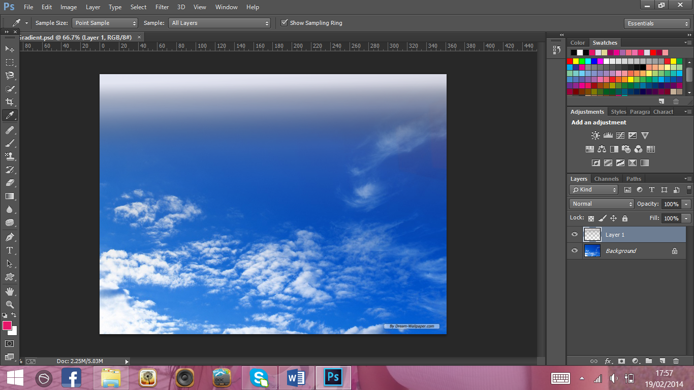
In later blog posts I will discuss and explain all of the experimenting I have done prior to making my final DVD inlay. While undertaking this experimenting I developed an idea using the sky. My vector shapes layout which was posted a few days ago shows how I intend on my final DVD front cover to have the main image at the bottom. I am not very keen on having this image just simply stop with a harsh line across the front of my inlay and hence I needed a solution. For this reason I did some research around Photoshop and came across a tutorial on adding gradients to images. This seemed like a good solution to my problem. I tested this on an image of the sky so I got an idea of what this could look like as a final piece.

What did I do?

To begin with I simply used to the internet to find an image of the sky. This original image can be seen below. Reference - http://all-free-download.com/free-photos/blue-sky-clouds-background.html - Accessed 20/02/2014.
 

I then opened this image into a blank Photoshop canvas. The first thing I did after this was create a new transparent layer. To do this I simply went to Layer, New and then Layer. I then copied and pasted my sky image into the new transparent layer. I then used the Gradient Tool, this can be found in the Tool Panel down the left hand side of the screen. A new Tool Bar appears along the top of the screen, the second icon in (Gradient Picker) allowed me to select which gradient effect I wanted to use. Due to the fact that my DVD inlay is likely to use a lot of white I decided I need my gradient to fade out to white. None of the standard gradient tools allowed me to do this and hence I had to customise one. I selected the ‘Neutral Density’ gradient tool and then opened its settings to change the colours. I simply clicked on the coloured marker and changed the colour of this from black to white. I then simply clicked ‘Ok’.

The next aspects I needed to change was the type of gradient I used. There are 5 different types to choose from, Linear, Radial, Angle, Reflected and finally Diamond. Each symbol represented each type gradient and hence I didn’t need to try each one to decide which I wanted. I selected the Linear tool.

To apply this gradient to my image I simply dragged the gradient line down the middle of my image from top to roughly one third of the way down. The white aspect of the gradient was then at the top of my image and this faded down into the image.
 
The below image shows how my gradient looked once finished.
 

My results and evaluation:

The end result of using this gradient tool were highly effective. This eliminated the issues I feel I would have had if I added an image straight to my inlay. This gradient would allow one aspect of my inlay to merge with another without leaving harsh lines. The perks of using this tool are that I am able to change the gradient colour to suit the area I want to merge together and hence I could use this technique in many different areas as well as allow room for colour changes throughout the developing process. This was a very simple effect to apply but I feel will help make my final piece look professional and I definitely think this is a technique I will use towards my final product. Although I did use a tutorial to help create this effect I adapted it to suit what I was trying to achieve and didn’t stick to it solely however the reference link is: http://www.youtube.com/watch?v=NxJi6l4d2wo and this was accessed 19/02/2014

Photoshop - First Self-taught tutorial


Self-taught tutorials:

In a later post I will explain and show all the experiments I have undertaken before starting my final DVD inlay. Before and during my experiments I decided that I wanted to look around the subject slightly more, this was to not only broaden my knowledge of Photoshop but also explore all the options I have when creating this piece of work. In my previous post I discussed the idea of having a heart shape on the back cover of my DVD inlay which would house the film information. As I experimented with this it became apparent that I had little knowledge behind how I would actually achieve this look. This was hence the first feature I began to delve into. I came across a website which gave many different Photoshop tutorials for all different areas of the software, this site had a tutorial for using text frames.

What did I do?

I began by opening a Photoshop document and setting a random canvas size, this was due to the fact that I was simply trying and testing the idea rather than applying it to my template. I then selected the Custom Shape Tool. This can be found hidden behind the Rectangle Tool in the Tool Panel down the left hand side of the screen.

While I had the Custom Shape Tool selected, I clicked on the shape preview thumbnail in the Options Bar, this can be found along the top of the screen. The Shape Picker then opens to display a variety of different shapes, to select a shape I simply clicked on the one I wanted. To begin with I selected the heart shape as this was my initial idea but as you read through you will see I actually ended up testing a variety of different shapes to see their affects.

In the same tool bar as the Shape Picker is a small drop down menu which has three options – Shape, Path and Pixels. This is normally by default set to Shape however for this tutorial to work I had to change this setting to Path. This Path is the outline of the shape. It acts as a path for the text as it is not able to type outside of this ‘Path’. I then simply drew the shape onto the canvas.

An issue which I found when creating this shape was that once I had positioned it I couldn’t get it to move/rotate/reshape. In order to achieve this I had to use the Edit Menu and then select the ‘Free Transform Path’ button. Once I had changed the size of my shape I then pressed Enter to apply these changes.

Now I had to add the text to my image. To do this I selected the Type Tool in the Tool Panel down the left hand side of the screen. I used the Horizontal Type Tool however there were other options to choose from. This maybe something to change depending on the Shape Path used. I was then able to change the size, font and colour of the Type in the Tool Bar along the top of the screen. To add my text I simply placed the cursor inside the Path of my shape and clicked. I could then add my text. To apply and finish this tutorial I simply used the tick button along the top Tool Bar. The Path outline then disappeared and in theory the type should be in the shape selected.


My results and evaluation:

When I found this tutorial I was really pleased based on the result that they displayed could be achieved. When I first used this tutorial for the heart shape my text didn’t fill the whole shape. For this reason I changed the text size and also the font to try to achieve the same look. This just didn’t work as intended. I played around with this shape for ages but still had no luck. When the Shape Path was removed the text wasn’t in a distinguished enough shape to still tell what I was trying to achieve and hence it looked unprofessional and messy. The images below show three separate stages of this technique including the final result. In comparison to what I was expecting to achieve you can clearly see why I was disappointed with this result. I was prepared to rule this technique out altogether based on one shape not going as planned and for this reason I tried again with two different shapes. The next shape path I tested was a flower. I wanted to try and keep with my girly/feminine theme and hence this justifies the shape. I spent time changing and adapting the text inside of this path like I did with the heart to try to improve the look of this piece however the final result ended up as poorly as the heart. This hence completely changed my ideas for the back cover as I was no longer wanting or able to create this effect. Before completely admitting defeat with this technique I tried a much simpler shape. I used a rounded corner rectangle. This simply gave boundaries for my text and actually worked well. Although this wasn’t exactly as complex as I would have liked this simplicity looked so much better than the undefined complex shapes. For all of these reasons I feel that if I was to use this technique in my final piece I would need to use a basic shape. I have completely ruled out the use of the heart path.


Reference : 


Tuesday, 18 February 2014

Photoshop - DVD Inlay Layout

After making my final decisions on the theme of my DVD inlay and the colour scheme I aim to use I decided to apply all of these features and create a layout onto the basic template I had already made. The aim of this is to decide where I will place all the different elements of my DVD cover. When I come to bring all of my elements together I can simply replace or edit the layout and design which you can see I have made from the image below.

The front of the DVD inlay has a bar along the top, this will include all of the four main actor names. The first name will be in White with their surname in a different shade of Pink. There will be a small bow on this divide line. Below this will be the 5 star rating with a quote. I haven't decided exactly what this quote will be however other DVD inlays I have researched take a quote from a magazine company so this is something I will look into further. I like the idea of all of the stars being different colours however this still may change depending on how the front of my inlay looks as a whole. I don't want it to look too colourful and hence tacky. The title will sit under this star rating. This should overlap the main image but not cover it too much. Two small love hearts should fill in any white space under this. The biggest and most important aspect of my DVD cover is the main image. This will sit at the bottom of the inlay. I am undecided exactly how far up the page this will spread however it must at least reach the film title. Finally there will be an age rating in the bottom right hand corner.

The spine of my DVD inlay is very simple however from my research into existing products I found this was the most effective and hence applied it to my work. The bottom of the spine sits the age rating with the title nearer the top but still quite central as a whole. There will be two bows on the spine. One at the very top and one where the title finishes.

The back of the DVD inlay uses a lot of aspects I gathered from my research into existing products. The main focal point of the back cover is the large heart. This will be where I place all of my film information. I like the idea of displaying this information in an unconventional way. The design below shows 3 images spread diagonally across the back of my inlay, this is a rough number however subject to change. It is however more than likely that I will only be able to fit 3, 4 at a push images in this section. I placed the barcode in the top left hand corner of my inlay. This is mainly to save space as my film information takes up so much room. I do however feel this fills up the space which would otherwise be left blank. The bar along the bottom represents all of the film information in terms of running time, language etc... I have only allocated a small amount of space for this which I hope will work but this could be stretched at a push. Finally to decorate the back cover I added a small heart to follow the running theme from the front cover.

Photoshop - Colour Scheme Decision

Now that I have made my final decision on the overall theme of my DVD inlay it is important I look at which colours I want to use. After undertaking various research on current DVD inlays it became apparent just how important the colours can be. Those DVD inlays which used bright bold colours stood out much more than those who used simple colours and general black text. The DVD 'Friends With Kids' used the most random colour scheme but this surprisingly worked really well, this used pink and blue text with a mostly white back ground. My favourite and most inspirational use of colour and design has come from the film ' thebigWedding'. This used a mostly grey and black theme in relation to text however bright pink is used to make areas stand out. I particularly like the use of more than one colour in the title of this film and the way the actor names have been separated by colour. The target audience for my film is young/middle aged woman, this is due to the fact that it is a chick flick/RomCom. For this reason the colours I used should relate and appeal to this market. Although I don't have the set colour codes for the colours I wish to use yet I aim to use pinks, in both light and dark shades along with a small amount of purple. White is always a good and effective colour to use as it stands out on most backgrounds and hence I feel this is a colour I am most likely to use. I would like to steer away from black as I feel this is much to common and doesn't have the same girly affect that white would. I had originally liked the idea of using red as part of my colour scheme however I think a better look can be achieved by sticking to the more girly colours, I haven't ruled out the use of red and I aim to test this colour throughout the process however it is not part of my set colour scheme as of yet. There are many places and ways I wish to bring my colour scheme into light. The main and most obvious way I can do this is through the use of text. The title, actor names and star ratings will all use the colours mentioned above, I have white and a bright pink in mind for these particular bit however like anything when applied this is subject to change. The research into DVD inlays brought out my desire for a plain and basic spine as I felt this was most effective. For this reason I am to have a white spine with hot pink text. (This text will follow whatever is decided for the main title on the front of the inlay). I also aim to have a small heart on the top of the spine. This is likely to be in a shade of purple. The next idea which I have is in relation to the actors on the front of my inlay. These are more than likely to all have random coloured outfits on and hence this may look odd when pulled together. For this reason I aim to use techniques such as the Hue/Saturation effect tool to change the colour of just the girls outfits to tie in with the colour scheme. This I feel would be a simple yet effective way to bring everything together. The colours I aim to use for these outfits are pink (mostly a baby pink), light purple and a darker/rich purple. This is definitely something which is subject to change as it may not work as intended however from an aesthetics point of view I feel this would work well.

Monday, 17 February 2014

Photoshop - Final decisions


Final Decisions:

I feel that now is a good time within my project to make some final decisions for my film as a whole but most importantly my DVD inlay. My DVD as a whole will be set around 4 woman who go to Paris together rather than spending Valentine’s Day alone. The four actors will be Sarah Jessica Parker, Cynthia Nixon, Cameron Diaz and finally Mila Kunis. Based on my research into existing DVD inlays I have decided that I would like my design to include a background image and all four girls. Previous Sex and the City films only used Sarah Jessica Parker however this didn’t appeal to me. Another design I explored included the idea of having four separate images of the actors however I have also gone against this idea based on personal preference. Due to the setting of my film I would like to use an Eiffel Tower background. The front will also be home to the film title. I have decided my film will be called ‘What happens in Paris, stays in Paris’. I would also like the front of my inlay to include all four actor names, these will preferably be along the top however this is subject to change based on how my final product looks when it’s pulled together. My hand drawn designs also included a star rating, this is something I would like to continue and use in my final piece however I haven’t decided exactly where I want to place it yet. The age rating to my film will be a 15, this will be displayed in the bottom right hand corner. Now I have made my decisions my next step is to decide on a colour scheme for my DVD inlay and finally apply both these decisions, and my colour scheme to a template which will map out the key areas of my inlay. I will use the colours within my colour scheme on this map/template in order to tie all my ideas together in one place.

Friday, 14 February 2014

Logo Ideas


When creating my DVD project it was important to create my own logo/brand. The first aspect I thought about was the name of my brand. I didn't have many ideas in this area but came up with KacMedia. These are my initials followed by simply Media. I began my research for a design online. Although the internet was full of different ideas there were very few which I actually liked. I found that any with bright colours caught my eye first and hence my logo must include bright colours. I also found that the simpler the better. A logo with slick lines and a simple basis stood out the most. When these simple shapes where mixed with bright colours the results were really eye catching. Another idea which caught my eye was by making the KacMedia a picture. Many logo's did this using word art in many different ways. Within my sketches you can see some of my ideas for this style but also for the simple shapes/lines style. Below are the ideas I found on the internet which I could have in some cases have used as inspiration. In a later post I will narrow my ideas down to my favourite 3 and then make a decision on which logo I will create and use for my product.


There was one website which I found particularly helpful. This website had many different logo ideas from simple shapes with bright colours. The weblink for this is as follows: http://www.ozoneeleven.com/freebies/120-creative-beautiful-free-vector-logo-design-inspirations/ 


Thursday, 13 February 2014

Colours


There are two main types of colour choices when it comes to Photoshop. The first and most common is RGB. These 3 letters stand for Red, Green and Blue. These are standard colours and can be found in the right hand bar of the screen. Each of these colours have a slider between 0 and 255. The second is hexadecimal colours. These use a number and letter system to give each colour a code. RGB colour and Hexadecimal colour link together. Red, Green and Blue are all classed as light sources. The lowest value that can be given to one of the light sources is 0 (hex 00). The highest value is 255 (hex FF). A Hexadecimal value is written as 3 double digit numbers, starting with a # sign. The combination of Red, Green and Blue values from 0 to 255 gives a total of more than 16 million different colours to play with (256 x 256 x 256) however modern monitors are capable of displaying at around 16384 different colours. To achieve the various colours you change the number of the RGB. Photoshop is helpful and gives you a hexadecimal equivalent based on this but also works in the opposite way. If you know the hexadecimal value it will provide you with the number of RGB particles. For every hexadecimal figure there is a plain English equivalent. This can be seen in the chart.


Photoshop - Hand Drawn Design Ideas

After looking at current DVD covers I have designed 5 of my own. I have tired to use different ideas for each however I have taken aspects which I like most and used them in more than one design. Although I haven't completely decided which design I like best I aim to use aspects from many different designs to achieve the most professional look.