This blog post shows my second film logo. Like my previous logo I used a tutorial to help me create this design. The web link for this tutorial is:
http://abduzeedo.com/creating-crazy-cool-logo This was accessed on 10/03/2014. The image below shows what the tutorial claimed could be created.
This logo immediately appealed to me because it looked so quirky and unique. The colours are bold and the lines are simple yet effective. I was intrigued as to how this logo could be created and hence this tutorial really stood out for me.
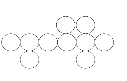
The next step in this tutorial was to add some height to this line of Ellipses. In order to do this I simply added further Ellipse on top of and below this line. The tutorial did this to create the letter G and Z however these weren't required in my logo name so I decided that I would just use this technique for aesthical purposes. This can be seen below.
The next step in this tutorial I found the most difficult. This could be because it was a completely new technique which I had never come across before. Using the direct Selection Tool I selected the Ellipse and then chose various points on this. See Below.
With this point selected I then used the keyboard to delete this aspect of the circle. This technique worked in quarters and hence I could delete anything from one quarter of the circle to three quarters. In the case of the tutorial they deleted areas based on what they wanted the logo to say however as this didn't apply to me I simply deleted aspects based on how my logo looked. The image below shows which aspects and how much of this I chose to remove using this technique.
This has now created the basic shape for my logo. The next stage was to add colour and effect. To begin with I decided to add colour to my logo. After my previous design I decided that I actually preferred the colour scheme which included the two main colours from my designs but also the light blue. This seemed to add a contrast and make the logo stand out from the rest. For this reason I used Pink, Blue and Purple in this logo.
Looking at the different effects I could use on this logo I decided I would start with using the Gaussian Blur. I used this effect on two of my vector shapes. The screenshot below shows the level of blur which I added to these ellipses.
The final effect I used was not technically an effect. I changed the opacity of some of the shapes. This added diversity to my logo and prevented it from turning into a boring vector shape logo. The opacity levels for these vector shapes can be seen below. This was 56%.
My logo with these effects added can be seen below.
The final stage of this logo creation was to add my film title. I stuck by my initial design and used the same font. This was Harlow Solid Italic. The size of this font was 7pt. This was simply because it worked in relation to the size of my logo. I changed the colour of my font to White and then added a bright Pink Stoke. This made it stand out.
When comparing my finished logo with the tutorials finished logo it is clear to see the variations however this is mainly based on the colours and effects which have been used. I really like this logo however I will evaluate this properly in a separate post when I come to decide which logo I will use on my final pieces.


No comments:
Post a Comment